 Another photograph used on the content page
Showing posts with label I-appendix main task planning work. Show all posts
Showing posts with label I-appendix main task planning work. Show all posts
Thursday, 24 March 2011


Tuesday, 30 November 2010
OneView music magazine main mood board

My Music Magazine 'OneView'
'Don't look at the future, look now'
This is the slougean for my magazine, saying spend what you want now and don't look to the future until it comes.
Target audience- go to gigs, festivals, love there fashion, style, individal aspects, the perfect teen life.
My mood board shows colour and style that my target audience (16-30) would like plus what tv programs, music, clothes and drink they would have or like.
Reader Profile
facts of 'OneView'
-The weekly reader spends upto £500 on clothes per year (Adidas, vans, brogues, denim and chinos)
-It's worth paying fpr extra quality goods 70%
-95% use the internet (online shopping, gig tickets)
-Goes out on average once a week i.e. friday or saturday night out or down the pub on a week day (jagger bombs, cider)
-male readers 75% females 25%
-on average 76% can drive
- 96% of readers watch 3 hours worth of tv daily
-90% own a mp3 or ipod
Journalism techniques for my music magazine
Double page spread
News writing attempts to answer all the basic questions about any particular event; in this case a music magazine! who, what, when, where and why (the Five Ws) and also often how - at the opening of the article. This form of structure is sometimes called the "inverted pyramid", to refer to the decreasing importance of information in subsequent paragraphs. This structure helps me to understand how to write up a article of a band on my double page spread.
News writing attempts to answer all the basic questions about any particular event; in this case a music magazine! who, what, when, where and why (the Five Ws) and also often how - at the opening of the article. This form of structure is sometimes called the "inverted pyramid", to refer to the decreasing importance of information in subsequent paragraphs. This structure helps me to understand how to write up a article of a band on my double page spread.
Monday, 29 November 2010
notes of double page spread for my magazine!

For my double page spread is going to be a artical on my made up band! 'AngliaThree' who also cover the front cover! In most double spread pages it shows white space, starting with the heading at the top, meanly about the band or the bands name, it has to be a big and bold font with a destrictive colour. secondly i will show a few 'pull quotes' from the bands interview. thirdy subheadings are important to have so you know which memeber or what bit they are talking about for example new album, gigs and singles. also a caption helps what the band are doing in the photograph. A drop cap is a good way of opening a article about a band. furthurmore a kicker and gutters making up the rest of a good solid base for my double page spread.
Wednesday, 24 November 2010
music journalism practice

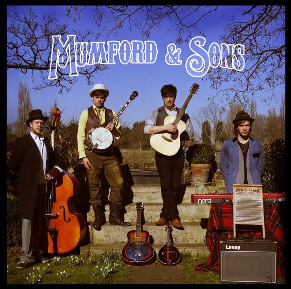
Journalism review of mumford and sons the band and the album 'sigh no more'
nme magazine..
Mumford and Sons might sound like the name of a rusty old tribute band simply because of the quality playing around by your mum as a nipper, but in fact it’s the ongoing concern of four young fellows from London, a name that fixes the band in a long tradition of ramblin’,truth-tellers with guitars, and proudly announces authenticity shot through their spindly frames like sticks of rock. All of which is complete bollocks, of course. They’re no more authentic than my dog talking english. but it shows a certain passion and heartfelt attention to detail which could be about to serve Marcus Mumford and his merry band of cohorts mighty well indeed.Formed in late 2007 through a shared love of country, bluegrass and folk, the Mummers belong to a clique that’s already scaled grand artistic peaks; performers such as Laura Marling and Noah And The Whale. The folk boy band will appeal if you like your folk expansive (think Fleet Foxes)you may well get a fair few kicks throughout the record's 48 minutes but only a small kick!
The Sun- tabloid newspaper..
Mumford and sons album Sigh no more shows real depth in character and shows true lyrics which not alot of audience would aprove the type of music which is Folk! but good on the lads giving it ago to the market which is filled with x factor and chart hitting music. the album which i agree started off as a small target audience and has turned out to be a great hit with a verity of audiences such as elderly people and teenagers which alot of the music in the industry can not break through at the moment. Cutting to the bad things from the album Sigh No More and the bad people who haven't got much culture instead to even give the band a chance because of the type of music say the record is dull, it’s limp. It lacks character. It has more than a little of the try-hard about it.
The difference between my two reviews is that the nme magazine review i wrote shows more about music and culture than The sun newspaper what doesn't specialise in music. Plus the nme one shows more facts and opinions and introducers other artists. I done the sun in a quick written fashion expressing quick points and small opinions to the reader. The nme reviw is longer because it's a magazine showing off more about the band compared to The sun newspaper which is a quick read and appeals to a verity of audiences and much more cheaper.
Tuesday, 23 November 2010
Second mood board and target audience for my magazine!

My second mood board for my target audience is for the age 20-30 mainly showing more sides to my magazine with culture, style and muisc. My target audince is 16 to 30 years in genral this just splits the divide and give every age there bit.
mood board and target audience for my magazine!

For my music magazine i have designed two mood boards. the first showing the younger teen side to my magazine for 16 to 20 years. The second being the age group between 20 and 30 years showing the verity of my magazine music (Nme music magazine covers) culture, fashion (Adidas originals)festivals and tv programs (skins and misfits).
Monday, 22 November 2010
Institutional data 'overall of industry'
IPC A Leading Magazine Publisher In The UK.
IPC Media produces over 85 iconic media brands, with our print brands alone reaching almost two thirds of UK women and 44% of UK men – almost 27 million UK adults – while our online brands collectively reach 20 million users every month.
The men's portfolio (IPC Inspire) comprises a wealth of leisure brands including Country Life, Horse & Hound, Rugby World and Decanter, as well as lifestyle brands including Nuts, Mousebreaker and NME.
The mass market women's division (IPC Connect) comprises famous women's weeklies including Look, Now, Chat and Woman; TV entertainment brands including What's on TV, TVTimes and TV & Satellite Week and, online, the goodtoknow network.
There are all different media brands, IPC media magazine publishing industry shows a wide verity of music, fashion, style and tv magazines for both male and females.
IPC is a consumer magazine and digital publisher in the United Kingdom, with a large portfolio selling over 350 million copies each year. Shows it isn't just for muisc magazines what we are doing but all sorts such as food, tv and clothing mags
IPC Media produces over 85 iconic media brands, with our print brands alone reaching almost two thirds of UK women and 44% of UK men – almost 27 million UK adults – while our online brands collectively reach 20 million users every month.
The men's portfolio (IPC Inspire) comprises a wealth of leisure brands including Country Life, Horse & Hound, Rugby World and Decanter, as well as lifestyle brands including Nuts, Mousebreaker and NME.
The mass market women's division (IPC Connect) comprises famous women's weeklies including Look, Now, Chat and Woman; TV entertainment brands including What's on TV, TVTimes and TV & Satellite Week and, online, the goodtoknow network.
There are all different media brands, IPC media magazine publishing industry shows a wide verity of music, fashion, style and tv magazines for both male and females.
IPC is a consumer magazine and digital publisher in the United Kingdom, with a large portfolio selling over 350 million copies each year. Shows it isn't just for muisc magazines what we are doing but all sorts such as food, tv and clothing mags
Insititional data 'Music magazine'

NME magazine figures what my magazine will be similar to!
Key facts is the price of the magazine, nme prices it at £2.20 which for the target audience the reader shows 34% are working full time, 18% are part time and 26& show there full time students. This is a indercation that the price is corrently correct it's not that expensive or to cheap. the frequency of NME is weekly which mine would be to keep the readers up to scratch with up coming bands, gigs and articles. the gender of NME magazine readers show males much popular into the magazine read with 73% males reading nme and 27% female showing another indercation of the market i am looking at. Average age of nme target audience is 25 which shows the marial status probably single still and the socal status show 71% should be starting a intermadiate managerial or professional full time job or show there low middle class. to conclude the key facts the target market for nme show men aged between 17 and 30. 80% of nme readers feel that music is an important part of thier lives, for my magazine this fact helps me out alot showing music and music only is the most important for the magazine and not fashion or tv programs.
Friday, 19 November 2010


First analysis of featured articles!
 My first featured article i am analysing is from the Q magazine. it shows one image covering three quaters of the page to tell the reader it about the artist which is Bradon Flowers holding a prop (guitar) showing what looks like a live loung performance. The wording of his name is in the centre of the page in big capital letters showing it's just about him. it shows in the article him expressing his feelings and himself with quotes. the one quotes what stands out the red bold writing is "I don't want people to think it's narcissistic." showing his emotions of his issues. The quote stands out well being a different colour to the article in black text.
analysis of first music magazine content page!

NME Content page
starting with a featured page of a band 'Africa exprez' which is a taster of the story inside. Nme show a story of a band/artist in every issue of there content page then the full article in the magazine. This week showing in bold writting showing what's in the magazine that week. the date of the issue is shown below it to indentify when gigs are on and what there doing that. subheadings showing regulars of reviews for example tracks and albums plus whats live that week on the right hand side. also there are features on the left hand side of the content page showing the band index of all the bands shown inside. the colours are the normal ones for nme, white, black and red. the colours of the band are shown in red and the page reference in black to make it is easier for the reader. it's easier to red for the younger audience (17-30) plus the socal status ABC1 showing a verity of readers from uper middle class people to lower middle classed junior managerial or professional.
Wednesday, 17 November 2010
Second analysis of a music magzine front cover

from the first analysis of an NME front cover , i have done a oppisite that by analysing a classical music magazine. you can tell from the main image (focal point) a female well educated, well dressed and holding a classical instrument in her hand. Additional images show a couple of small images in the bottom right hand corner expressing more classical and posh clothing and seriousness to the magazine theme. like all magazine from covers it shows one main story in this case 'Sarah Chang's' story of playing the shostakovich plus showing other mini stories of other classical muiscian/ instrumentalist. compare to NME the colours are much less in your face and more formal using plain colours (red,white and balck). The Demographic profile includes age showing this classical magazine aimed more towards over 40's who like classical cultured music.Marital status who read this magazine are most probably married and there socal status is definitely in A (Upper middle class, higher managerial or profession) showing the magazine is expensive and these particular type of audence show they can pay for it. lastly the magzine being the price it and the images there it is obviously a formal written music magazine.
Tuesday, 16 November 2010
First analysis of front cover music magazine

NME Magazine
The masthead of my first music magazine analysis is the NME Christmas special edition one. The main image usually has a star/band as the main photograph for the front, the one I’m analysing show a band called Arctic Monkeys (Alternative rock) with the band posing ‘We bet you don't look good on the dance floor’ - dressed like this...It's the festive season and those Arctic Monkeys are getting into the spirit of things with this wacky fancy-dress Crimbo in image. The lads' elves sported cuts and bruises in the image as if it had all got a bit tasty at the pub next to Santa's Grotto. But the Monkeys' moody faces were all natural. There are no additional images related to story just one image of band showing there the focal point. Selling line or catchphrase on the front is one of Arctic Monkeys album name called ‘Favourite worst nightmare’ is in the selling line/ catchphrase which is printed in the centre of the front cover clearly showing the text ‘Their favourite worst nightmare before Christmas’ to show its related to the image of the band and Christmas. The price on the front is £2.20 and it’s a weekly magazine so this one is relating over the Christmas festive season. The colour scheme of NME is normally red and has white and black on the front but for special edition ones and holiday season magazines they change for instance having snow lying on top of the masthead. The fonts are varied and the colour of the headline (name of band Arctic Monkeys) is in bold white text and the selling line in a brownish colour showing it’s there but the band’s name above it, is clearing shown more and to the readers eye.
Audience profile for Q magazine mood board
Q magazine for my mood board, the target audience is a Demographic profile and includes Ages between 18-30. Gender is 70 30 male readers plus the Marital status is most probably mainly single. The Social status I think is C1 Supervisory and junior managerial or professional classes to show the group of middle class households or individuals who have not attained the status of the upper middle class. Also the Psychographic profile is in-between Succeeders (rich) and Aspirers (want the luxury lifestyle). The lifestyle subsets for the Q magazine is in the category just below the ‘Yuppies (20 -30s, urban, high disposable income). Relating to the images of of bands they would like for example kings of leon who have established band already, also with images of a middle band trying to make it big (Hurts). furthermore i posted images of fashion clothes they relates well what a regular reader would wear (Fred Perry polo shirt). lastly i posted the colour red because it is the colour of most magazine covers.
Q was first published in October 1986, setting itself apart from much of the other music press with monthly production and higher standards of photography and printing.
The magazine has an extensive review section, featuring new releases (music) film and live concert reviews, as well as radio and television reviews.
The magazine has an extensive review section, featuring new releases (music) film and live concert reviews, as well as radio and television reviews.
Monday, 15 November 2010


Friday, 12 November 2010
Subscribe to:
Posts (Atom)